R語言餅圖圖表
R語言編寫有許多庫用來創建圖表和圖形。餅圖是表示不同顏色的值的圓片。切片標記和對應於各切片的數量也被表示在圖表中。
R語言中的餅圖使用 pie()函數,接受正數作為一個向量輸入來創建。附加參數用於控製標簽,顏色,標題等
語法
使用R創建一個餅圖基本語法:
pie(x, labels, radius, main, col, clockwise)
以下是所使用的參數的說明:
- x - 是包含在餅圖中使用的數值的矢量。
- labels - 用於給出切片的描述。
- radius - 指示餅圖的圓的半徑。(-1和+1之間的值)。
- main - 指示圖表的標題。
- col - 指示調色板。
- clockwise - 是一個邏輯值指示該切片繪製順時針或逆時針方向。
示例
隻用了輸入向量和標簽創建了一個非常簡單的餅圖。下麵的腳本將創建並保存餅圖到R的當前工作目錄。
# Create data for the graph.
x <- c(21, 62, 10, 53)
labels <- c("London", "New York", "Singapore", "Mumbai")

# Give the chart file a name.
png(file = "city.jpg")

# Plot the chart.
pie(x,labels)

# Save the file.
dev.off()
當我們上麵的代碼執行時,它產生以下結果:
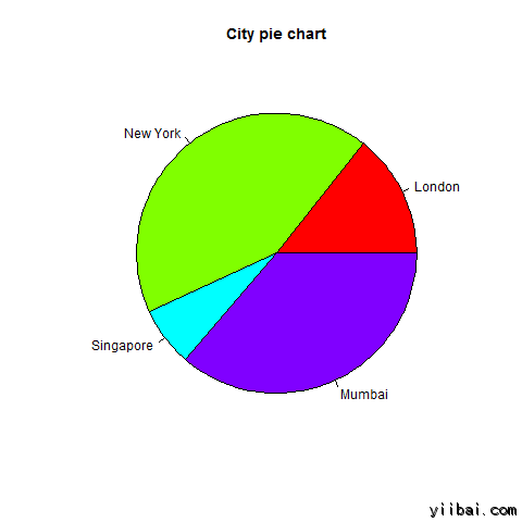
餅圖的標題和顏色
我們可以通過添加函數更多的參數擴展圖表的特性。我們將使用參數 main 作為標題添加到圖表,另一個參數是 col,將利用彩虹調色板在繪製的圖表時。托板的長度應相同於圖表值的數目。因此,我們使用 length(x)。
示例
下麵的腳本將創建並保存餅圖到R的當前工作目錄。
# Create data for the graph.
x <- c(21, 62, 10, 53)
labels <- c("London", "New York", "Singapore", "Mumbai")

# Give the chart file a name.
png(file = "city_title_colours.jpg")

# Plot the chart with title and rainbow color pallet.
pie(x, labels, main="City pie chart", col=rainbow(length(x)))

# Save the file.
dev.off()
當我們上麵的代碼執行時,它產生以下結果:
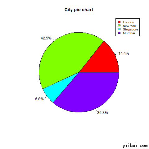
切片百分比和圖表圖例
我們可以通過創建額外的圖表變量添加切片百分比和圖表圖例。
# Create data for the graph.
x <-  c(21, 62, 10,53)
labels <-  c("London","New York","Singapore","Mumbai")


piepercent<- round(100*x/sum(x), 1)

# Give the chart file a name.
png(file = "city_percentage_legends.jpg")

# Plot the chart.
pie(x, labels=piepercent, main="City pie chart",col=rainbow(length(x)))
legend("topright", c("London","New York","Singapore","Mumbai"), cex=0.8, fill=rainbow(length(x)))

# Save the file.
dev.off()
當我們上麵的代碼執行時,它產生以下結果:
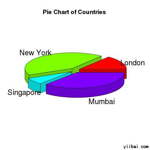
3D 餅形圖
餅圖和3個維度需要使用額外的軟件包繪製。軟件包:plotrix 稱為 pie3D(一個函數,被用於此目的)。# Get the library.
library(plotrix)
# Create data for the graph.
x <- c(21, 62, 10,53)
lbl <- c("London","New York","Singapore","Mumbai")
# Give the chart file a name.
png(file = "3d_pie_chart.jpg")
# Plot the chart.
pie3D(x,labels=lbl,explode=0.1,
main="Pie Chart of Countries ")
# Save the file.
dev.off()
當我們上麵的代碼執行時,它產生以下結果: