R語言線型圖
線性圖是通過繪製它們之間的線段連接的一係列點的圖表。這些點是有序的在其坐標(通常是x坐標)值中的一個。線圖通常用於識彆趨勢的數據。
R中的 plot()函數是用於創建線圖。語法
R中用來創建一個線圖基本的語法來是:plot(v,type,col,xlab,ylab)
以下是所使用的參數的說明:
-
v - 是一個包含數字值的向量。
-
type - 取值“p”隻是用來繪製點,“i”隻繪製線條,而 “o”畫兩個點和線。
-
xlab - 是標簽為X軸。
-
ylab - 是標簽為Y軸。
-
main - 是圖表的標題。
-
col - 用於給出點和線的顏色。
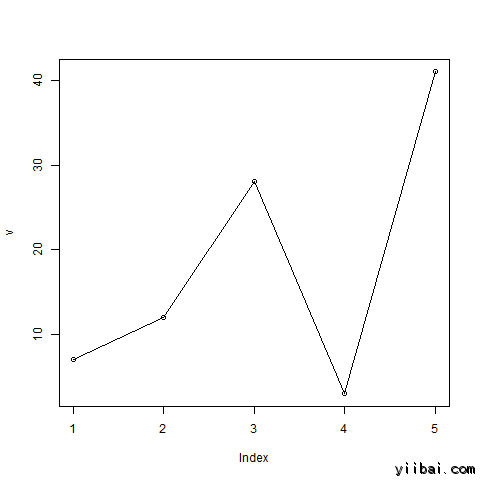
示例
使用輸入向量和類型參數為“O”來創建一個簡單的折線圖。 下麵的腳本將創建和保存線圖在R的當前工作目錄。
# Create the data for the chart.
v <- c(7,12,28,3,41)

# Give the chart file a name.
png(file = "line_chart.jpg")

# Plot the bar chart.
plot(v,type="o")

# Save the file.
dev.off()
當我們上麵的代碼執行時,它產生以下結果:
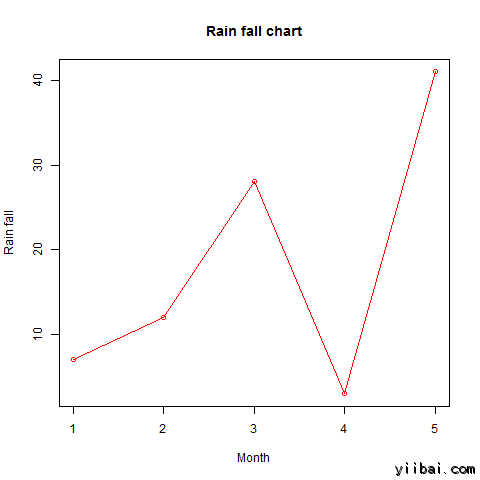
線圖表標題,顏色和標簽
線圖的特征可通過使用附加參數進行擴展。我們增添點和線的顏色,給出圖表的標題,並添加軸的標簽。
示例
# Create the data for the chart.
v <- c(7,12,28,3,41)

# Give the chart file a name.
png(file = "line_chart_label_colored.jpg")

# Plot the bar chart.
plot(v,type="o",col="red",xlab="Month",ylab="Rain fall",main="Rain fall chart")

# Save the file.
dev.off()
當我們上麵的代碼執行時,它產生以下結果:
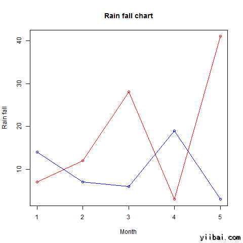
線圖中的多條直線
多於一行可以通過使用 lines()函數來繪製在同一圖表上。
第一線繪製之後,line()函數可以使用一個附加的矢量作為輸入來繪製第二條線在圖中
# Create the data for the chart.
v <- c(7,12,28,3,41)
t <- c(14,7,6,19,3)

# Give the chart file a name.
png(file = "line_chart_2_lines.jpg")

# Plot the bar chart.
plot(v,type="o",col="red",xlab="Month",ylab="Rain fall",main="Rain fall chart")

lines(t, type="o", col="blue")

# Save the file.
dev.off()
當我們上麵的代碼執行時,它產生以下結果: