R語言正態分布
在隨機收集來自獨立源的數據,所以一般觀察到的數據的分布是正常的。 這意味著,在繪製的曲線圖與可變的水平軸的值和這些值中的垂直軸的計數,我們得到一個鐘形曲線。該曲線的中心表示所述數據集的平均值。 在圖中,集值的百分之五十顯示平均值在左邊以及其他百分之五十顯示到圖的右側。這在統計中被稱為正態分布。
R語言中有四個內置函數生成正態分布。它們被描述如下。
dnorm(x, mean, sd)
pnorm(x, mean, sd)
qnorm(p, mean, sd)
rnorm(n, mean, sd)
以下是在上述功能中使用的參數的說明:
- x 是數字向量
- p 是概率的向量
- n 是觀測值(樣本量)數。
- mean 是樣本數據的平均值。它的默認值是零。
- sd 是標準偏差。它的默認值是1。
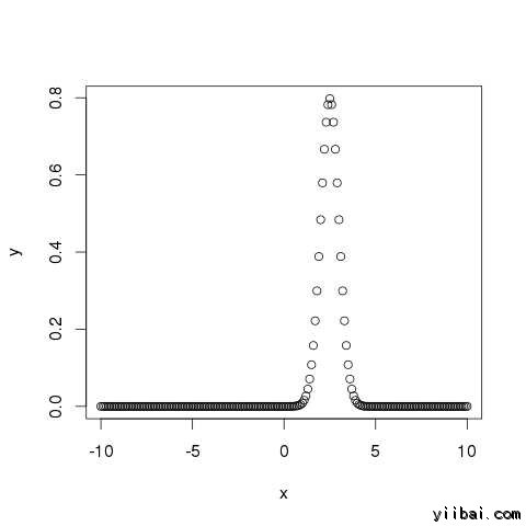
dnorm()
此函數提供概率分布的高度在每個點處對於給定的平均值和標準偏差。
# Create a sequence of numbers between -10 and 10 incrementing by 0.1.
x <- seq(-10,10,by=.1)

# Choose the mean as 2.5 and standard deviation as 0.5.
y <- dnorm(x, mean= 2.5, sd = 0.5)

# Give the chart file a name.
png(file = "dnorm.png")

plot(x,y)

# Save the file.
dev.off()
當我們上麵的代碼執行時,它產生以下結果:
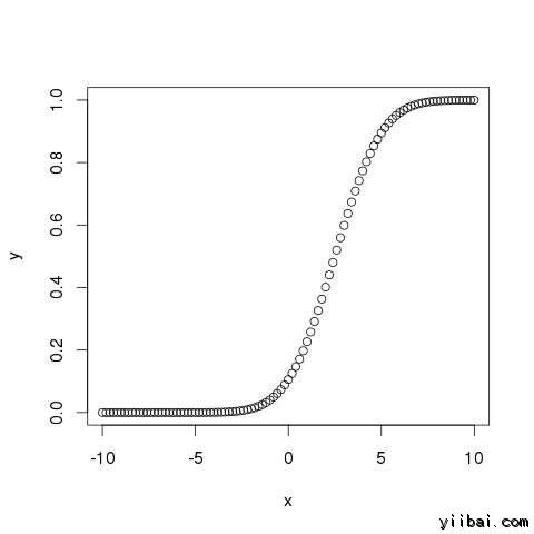
pnorm()
此函數給出的正態分布的隨機數的概率是不太一個給定數目的值。它也被稱為“累積分布函數”。
# Create a sequence of numbers between -10 and 10 incrementing by 0.2.
 x <- seq(-10,10,by=.2)

# Choose the mean as 2.5 and standard deviation as 2.
 y <- pnorm(x,mean=2.5,sd = 2)

# Give the chart file a name.
png(file = "pnorm.png")

# Plot the graph.
plot(x,y)

# Save the file.
dev.off()
當我們上麵的代碼執行時,它產生以下結果:
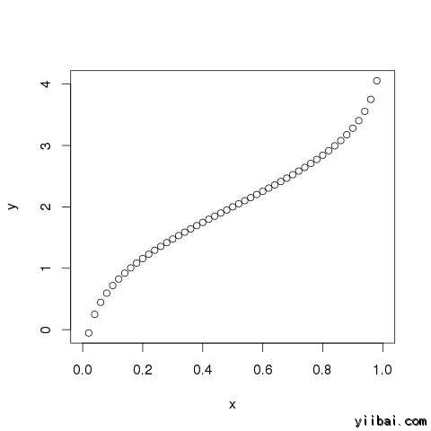
qnorm()
該函數接受概率值,並給出了一個數字,其累加相匹配的概率值。
# Create a sequence of probability values incrementing by 0.02.
x <- seq(0,1,by=0.02)

# Choose the mean as 2 and standard deviation as 3.
y <- qnorm(x,mean=2,sd=1)

# Give the chart file a name.
png(file = "qnorm.png")

# Plot the graph.
plot(x,y)

# Save the file.
dev.off()
當我們上麵的代碼執行時,它產生以下結果:
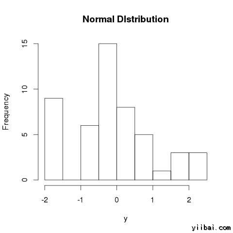
rnorm()
該函數是用來產生隨機數的分布為正常。它需要樣本大小作為輸入並產生許多隨機數。我們繪製的直方圖,以顯示所生成的數分布。
# Create a sample of 50 numbers which are normally distributed.
y <- rnorm(50)

# Give the chart file a name.
png(file = "rnorm.png")

# Plot the histogram for this sample.
hist(y, main = "Normal DIstribution")

# Save the file.
dev.off()
當我們上麵的代碼執行時,它產生以下結果: