R語言條形圖(柱狀圖)
條形圖代表在與條成比例的變量的值的長度矩形條數據。R使用函數barplot()來創建柱狀圖。R能夠繪製柱狀圖垂直和水平條。在柱狀圖中每個條都可以顯示不同的顏色。
語法
創建一個條形圖在R中的基本語法是:
barplot(H,xlab,ylab,main, names.arg,col)
以下是所使用的參數的說明:
- H - 是包含在柱狀圖中使用數值的矢量或矩陣。
- xlab - 是標簽為X軸。
- ylab - 是標簽為Y軸。
- main - 是柱狀圖的標題名稱
- names.arg - 是出現在每個條的向量名稱。
- col - 用於給出在圖中的條狀的顏色。
示例
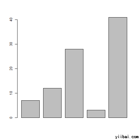
隻用輸入向量和每個欄的名稱創建一個簡單的柱狀圖。
下麵的腳本將創建並保存柱狀圖到R的當前工作目錄。
# Create the data for the chart.
H <- c(7,12,28,3,41)

# Give the chart file a name.
png(file = "barchart.png")

# Plot the bar chart.
barplot(H)

# Save the file.
dev.off()
當我們上麵的代碼執行時,它產生以下結果:
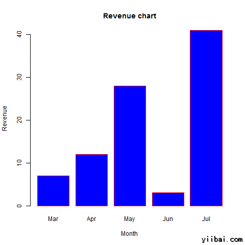
柱狀圖標簽,標題和顏色
柱狀圖的特征可以通過添加更多的參數進行擴展。 The main參數用於添加標題。col參數用於顏色添加到柱狀圖。args.name 是具有值作為輸入矢量的相同數量,用來描述每個條的含義。
示例
下麵的腳本將創建並保存柱狀圖到R的當前工作目錄。# Create the data for the chart.
H <- c(7,12,28,3,41)
M <- c("Mar","Apr","May","Jun","Jul")
# Give the chart file a name.
png(file = "barchart_months_revenue.png")
# Plot the bar chart.
barplot(H,names.arg=M,xlab="Month",ylab="Revenue",col="blue",
main="Revenue chart",border="red")
# Save the file.
dev.off()
當我們上麵的代碼執行時,它產生以下結果:
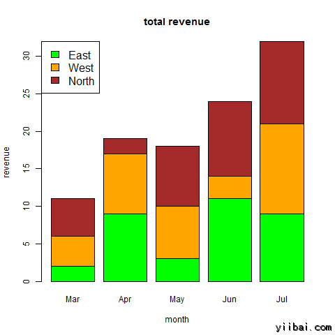
組柱狀圖和堆疊條形圖
我們可以用一個矩陣的輸入值來創建條形圖的條和疊層中的每個條組。
兩個以上的變量表示為它用於創建組柱狀圖和堆積條形圖的矩陣。
# Create the input vectors.
colors <- c("green","orange","brown")
months <- c("Mar","Apr","May","Jun","Jul")
regions <- c("East","West","North")

# Create the matrix of the values.
Values <- matrix(c(2,9,3,11,9,4,8,7,3,12,5,2,8,10,11),nrow=3,ncol=5,byrow=TRUE)

# Give the chart file a name.
png(file = "barchart_stacked.png")

# Create the bar chart.
barplot(Values,main="total revenue",names.arg=months,xlab="month",ylab="revenue",col=colors)

# Add the legend to the chart.
legend("topleft", regions, cex=1.3, fill=colors)

# Save the file.
dev.off()
當我們上麵的代碼執行時,它產生以下結果: