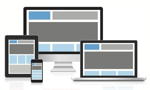
響應式網頁設計提供最佳體驗、輕鬆閱讀和輕鬆導航,只需在不同設備(如台式機、手機和標籤)上調整大小即可。
Responsive structure
下圖顯示了網頁的響應結構。

Flexible Grid demo
<html>
   <head>
      <style>
         body {
            font: 600 14px/24px "Open Sans",
               "HelveticaNeue-Light",
               "Helvetica Neue Light",
               "Helvetica Neue",
               Helvetica, Arial,
               "Lucida Grande",
               Sans-Serif;
         }
         h1 {
            color: #9799a7;
            font-size: 14px;
            font-weight: bold;
            margin-bottom: 6px;
         }
         .container:before, .container:after {
            content: "";
            display: table;
         }
         .container:after {
            clear: both;
         }
         .container {
            background: #eaeaed;
            margin-bottom: 24px;
            *zoom: 1;
         }
         .container-75 {
            width: 75%;
         }
         .container-50 {
            margin-bottom: 0;
            width: 50%;
         }
         .container, section, aside {
            border-radius: 6px;
         }
         section, aside {
            background: #2db34a;
            color: #fff;
            margin: 1.858736059%;
            padding: 20px 0;
            text-align: center;
         }
         section {
            float: left;
            width: 63.197026%;
         }
         aside {
            float: right;
            width: 29.3680297%;
         }
      </style>
   </head>

   <body>

      <h1>100% Wide Container</h1>

      <div class = "container">
         <section>Section</section>
         <aside>Aside</aside>
      </div>

      <h1>75% Wide Container</h1>

      <div class = "container container-75">
         <section>Section</section>
         <aside>Aside</aside>
      </div>

      <h1>50% Wide Container</h1>

      <div class = "container container-50">
         <section>Section</section>
         <aside>Aside</aside>
      </div>

   </body>
</html>
它將產生以下結果&負;
Media queries
媒體查詢針對不同大小的設備(如手機、台式機等)的不同樣式規則。,
<html>
   <head>
      <style>
         body {
            background-color: lightpink;
         }
         @media screen and (max-width: 420px) {
            body {
               background-color: lightblue;
            }
         }
      </style>
   </head>

   <body>
      <p>
         If screen size is less than 420px, then it will show lightblue
         color, or else it will show light pink color
      </p>
   </body>
</html>
它將產生以下結果&負;
Bootstrap responsive web design
Bootstrap是最流行的基於HTML、CSS和Java腳本的web設計框架,它幫助您爲所有設備以響應方式設計web頁面。
<html>
   <head>
      <meta charset = "utf-8">
      <meta name = "viewport" content = "width=device-width, initial-scale = 1">
      <link rel = "stylesheet"
         href = "http://maxcdn.bootstrapcdn.com/bootstrap/3.2.0/css/bootstrap.min.css">
      <style>
         body {
            color:green;
         }
      </style>
   </head>

   <body>

      <div class = "container">

         <div class = "jumbotron">
            <h1>Tutorials point</h1>
            <p>
               Tutorials Point originated from the idea that there exists a class
               of readers who respond better to online content and prefer to learn
               new skills at their own pace from the comforts of their drawing rooms.
            </p>
         </div>

         <div class = "row">
            <div class = "col-md-4">
               <h2>Android</h2>
               <p>
                  Android is an open source and Linux-based operating system for mobile
                  devices such as smartphones and tablet computers. Android was developed
                  by the Open Handset Alliance, led by Google, and other companies.
               </p>
         </div>

         <div class = "col-md-4">
            <h2>CSS</h2>
            <p>
               Cascading Style Sheets, fondly referred to as CSS, is a simple design
               language intended to simplify the process of making web pages presentable.
            </p>
         </div>

         <div class = "col-md-4">
            <h2>Java</h2>
            <p>
               Java is a high-level programming language originally developed by Sun
               Microsystems and released in 1995. Java runs on a variety of platforms,
               such as Windows, Mac OS, and the various versions of UNIX. This tutorial
               gives a complete understanding of Java.
            </p>
         </div>
      </div>

   </body>
</html>
它將產生以下結果&負;